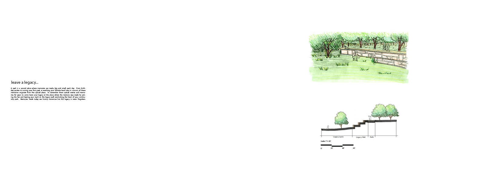
For this project we were asked to develop portfolio spreads in Adobe InDesign displaying a project of our choice from our past design studios. I decided to use my final project (Legacy Park) from my Parks and Open Space design studio. I created a series of spreads that walk through a short design process along with what is being proposed on the site. Here are my final spreads!
Tuesday, April 30, 2013
Monday, April 15, 2013
Unit 06: Precision Drafting with AutoCAD
For unit 06 our class was asked to explore the many uses and techniques AutoCAD has to offer when completing construction style documents that can be used to take our creative ideas and demonstrate how they can be feasible. We started off with a basic household setting to grasp a basic understanding of AutoCAD's power. We worked with site plans, dimensions, sections, and detailed plans and sections to describe what was happening on our site. Through this exercise we learned many techniques in AutoCAD such as line weights, layer management, complex commands, and hatching to name a few. Here is the finished product!
Tuesday, April 9, 2013
AutoCAD Plan + Section
Here are some preliminary plans and sections created for one of our checkpoints in class this week. Improvements to come!
Tuesday, March 26, 2013
SketchUP
For unit 7 we were asked to use our AutoCAD documents we previously created to be used as an aid in develop a 3D model of our site through the use of SketchUP. Here are some of the images taken directly from the model.
This image is an aerial view of my site:
This image is an aerial view of my site:
This image is a perspective view showing the backyard area:
This image is a plan view of the entire site:
This image is a section cut through my site. This section cut also shows the formation of my vegetated swale. This green infrastructure is created by the formation of topography sloping upwards around the driveway and home. This formation of topography creates a small depression where water can be more properly managed in the swale instead of running off the site at a fast rate.
Tuesday, March 19, 2013
AutoCAD :)
Here is my final AutoCAD project for Unit 6. For this project we were asked to practice our AutoCAD skills learned throughout the past week. This project situated several elements of a residential landscape together. I used various layers to draw the various elements of the residential space. Also the use of line weights creates depth and a make the drawing more user friendly to understand.
Monday, March 11, 2013
Unit 5b Final
Here are the final three presentation boards for Unit 5b. Board number one describes the analysis completed at the Muncie Fairgrounds. Topics such as storm water run-off, circulation, open space, and views into the sight were completed. Board number two shows before and after section/perspectives along key areas around the fairgrounds. Finally board number 3 displays a day and night perspective of what the site could look like.
Wednesday, February 20, 2013
Illustrator Diagrams Final
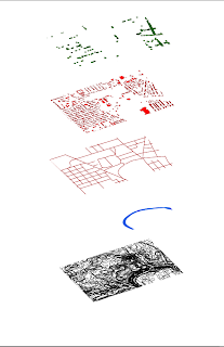
Here are my final diagrams for Unit 5. For this project I used GIS and AI computer programs to create analysis diagrams for the Muncie Fairgrounds. Topics that I presented include Storm Water, Circulation Patterns, Open Spaces, Buildings, Trees, and Wind Patterns. Showing one layer of information has the benefit of displaying specified pieces of information stacked together to create a cohesive analysis of the selected site.
Tuesday, February 19, 2013
Friday, February 15, 2013
Illustrator Diagrams Part 1
Shown here is a set of analytic diagrams created from GIS and then exported into Adobe Illustrator and separated into various layers of information. By transforming the diagrams to have a "staked" look, it organizes the information into layers that are easy to understand. With further practice color and labels can also be added.
Monday, February 11, 2013
Final GIS Maps
The map above displays large majority of Muncie, Indiana. For this map a chose to show my site with a saturated orange / yellow polygon. Other feature that I chose to display were Recreational Facilities, Schools, Trails, Railroads, Roads, Highways, Floodplains, and Wetlands. I used various colors for the transportation (roads, highways, trails, and railroads) to create the hierarchy of transportation throughout Muncie.
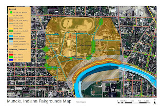
This map displays my site as a closer level for more detailed viewing. Transportation feature that I displayed in this map include trails (with buffer) and roadways. I also included the trees that are located on the site and included a buffer around them. Next I displayed the White River floodplain with buffer on my site. The buffer around objects helps later in the design process to help us understand what should be "left alone" or items that need consideration. Lastly I added in the soil conditions into the site. This helps establish an idea of what can be created on top of the soils listed for this site.
Tuesday, February 5, 2013
Thursday, January 31, 2013
GIS Part 1
Today in class we began our introduction into Geographic Information Systems. It was very interesting to learn about importing and exporting data files to and from ArchMap to create nearly any map you could imagine. To begin a project, this is usually the first step for a site analysis. Clicking on the roads (red), recreational facilities (green), or the river (blue) will bring up attribute tables. These tables provide nearly every piece of information you would ever need to know about the place you are investigating. From the average attendance of the fairgrounds to the flood plain of the White river in Muncie. These are the little, but important details that must be understood when tackling a project. Simply put one of the most massive and complex computer programs I have operated!
Wednesday, January 30, 2013
Photomontage Perspective
This project tested our skills with the use of photoshop layer management, which turned out to be very difficult at first, but then seemed very logical after trial and error (lots of error!). Starting with the ground plane I created a mostly flat grassy area to build upon and then the addition of the sky. Next I began to situate the paths with the transform command. I then started to add people/scale figures into the image with a blur/motion blur with shadow. Next I added in trees that resembled the plan which I previously submitted. I changed the opacity of the trees to help with the overall compositional feel of the image and also added in the tree shadows coming form the sunshine in the back of the image. I then added in the benches using the polygonal lasso tool. I finished the image by adding in some plants to soften up the feel of the composition and add some color. Practiceing this tool of creating perspective images on photoshop helps me see the true potential in photomontages.
*All images provided by Simon Bussiere
*All images provided by Simon Bussiere
Monday, January 28, 2013
Image Enhancement
Enhancing images on Photoshop turned out to be a very powerful tool to use. Using techniques under Image>Adjustment>and the chooses various image enhancing features such as exposure, vibrancy, and saturation. These developed an awesome recreation of an old photograph that says so much more. Enhancing images reveals more of the photographs character and unique detailed features once not seen.
Composite Planting Plan
For this project I created a composite Planting Plan through exploring the usage of layers in photoshop. I began by capturing a GoogleEarth image and then inserting sight lines experienced by individuals on the site. Next I decided to give the area a more "campus feel" by creating paths where the sight lines were. The paths were created on another layer, and then grass was added in to provide an idea of texture. Next trees were added into the site to define the green spaces created by the paths. I added shadows to the trees, people with shadows, and then blended the grass into the existing picture as final touches.
Tuesday, January 22, 2013
The Design Web
The design process uses several computer programs with one common design goal in mind. This image shows a possible avenue one can take to create a plan drawing.
Starting with Google Earth and Photoshop
Displaying a project site in a clear way is the first step to understanding a project's location, context, and the overall current state it is in. Highlighting and outlining the site creates a clear view of where the site boundaries are.
Thursday, January 17, 2013
Beginnings…
Diagrams that describe various site uses help clients determine the potential of the site being designed.
 |
| Plan view drawings help viewers understand the general layout of a specific site at a specific scale. |
 |
| Space diagrams help describe site specific conditions such as the impact sound has on a site. |
 |
| Perspectives are simply the best way to communicate a sense of space. |
As a class, to understand the where we want to see
ourselves at the end of the semester, we look to the experts in the field. Below are examples of projects with excellent computer
generated graphics that help views better understand creative ideas developed
by Landscape Architects.
Sources:
http://www.stoss.net/projects/2/erie-street-plaza/
http://www.stoss.net/projects/3/minneapolis-riverfront/
http://www.mvvainc.com/project.php?id=60&c=parks
Sources:
http://www.stoss.net/projects/2/erie-street-plaza/
http://www.mvvainc.com/project.php?id=60&c=parks
Subscribe to:
Comments (Atom)


.jpg)
.jpg)
.jpg)
.jpg)
.jpg)
.jpg)
.jpg)
.jpg)
.jpg)


.jpg)
